Sep
25
2012
Responsive Web Design: 50 Examples and Best Practices
 admin
admin blog,event
 10 Comments
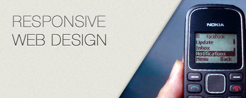
Responsive web design term is related to the concept of developing a website design in a manner that helps the lay out to get changed according to the user’s computer screen resolution. More precisely, the concept allows for an advanced 4 column layout 1292 pixels wide, on a 1025 pixel width screen, that auto-simplifies into 2 columns. Also, it suitably fixes on the smartphone and computer tablet screen. This particular designing technique we call “responsive web design”.
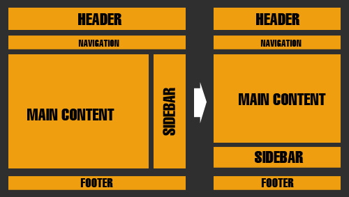
Responsive web designing is an entirely different designing version than traditional web designing, and developers (especially fresher) must know about the pros and cons of responsive web designing. This blog is a mighty example of the approach so we will reveal a few facts about the uses of responsive web designing. The basic instinct might be to choose media queries to develop a responsive site. However, the hassle one faces with media queries is that new queries can pop up from moment to moment; each time, the user experiences sudden and drastic changes to the look and organization of the site. Experts suggest using some CSS transitions to ease the jump.
Pages that include data tables pose a special challenge to the responsive web designer. Data tables are extremely wide by default, and when someone zooms out to see the whole table, it becomes too small to read. When one tries to zoom in to make it readable, he or she is supposed to scroll both horizontally and vertically to look through it. Well, there are several ways to avoid this problem. Reformatting the data table as a pie or mini-graph is an approved solution. The mini-graph fixes even in narrow screens.
Images in responsive web designs are called context-aware. This particular technique serves the purpose of responsive designing in true sense as the images serve at different resolutions, ranging from larger screens to smaller ones. The scaled images appear to change fluidly with the help of updated developer tools and coding languages, allowing designs to look sharp in every context. Responsive web designing is remarkably different from traditional designing in terms of technical and creative issues, and a careful use of this can do wonders while designing.
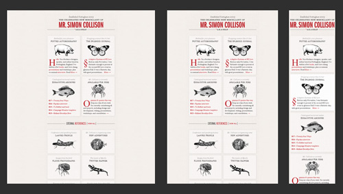
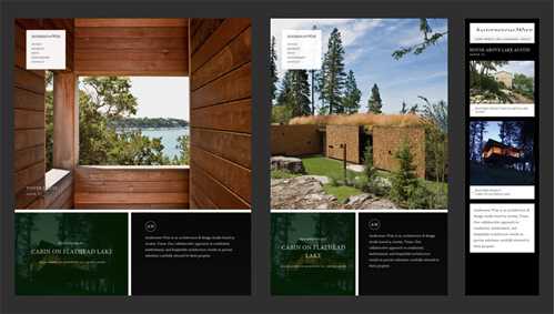
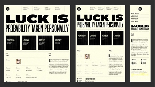
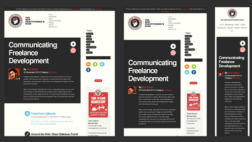
Responsive Web Design Examples
Lorem ipsum
Lorem ipsum
Lorem ipsum
Lorem ipsum
Lorem ipsum


September 22, 2012 8:45 am / Reply
Nulla lobortis facilisis eros vitae mollis. Morbi consectetur, tortor ut feugiat rhoncus, nunc augue placerat massa, sit amet laoreet est libero quis nisl. Integer cursus sodales sem eu dapibus. Morbi lobortis eleifend lectus sit amet porttitor. Nam tincidunt congue laoreet.