
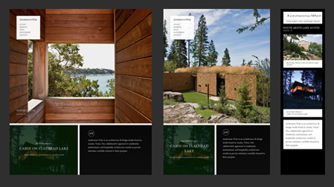
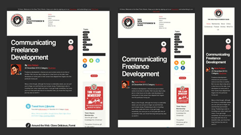
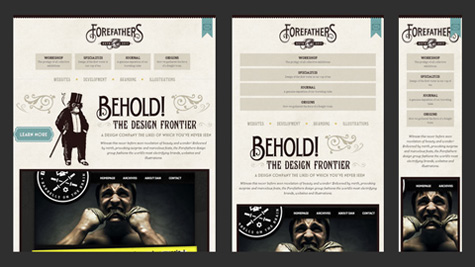
Almost every new client these days wants a mobile version of their website. It’s practically essential after all: one design for the BlackBerry, another for the iPhone, the iPad, netbook, Kindle — and all screen resolutions must be compatible, too. In the next five years, we’ll likely need to design for a number of additional inventions. When will the madness stop? It won’t, of course. In the field of Web design and development, we’re quickly getting to the point of being unable to keep up with the endless new resolutions and devices. For many websites, creating a website version for each resolution and new device would be impossible, or at least impractical. Should we just suffer the consequences of losing visitors from one device, for the benefit of gaining visitors from another? Or is there another option? Responsive Web design is the approach that suggests that design and development should respond to the user’s behavior and environment based on screen size, platform and orientation. The practice consists of a mix of flexible grids and layouts, images and an intelligent use of CSS media queries. As the user switches from their laptop to iPad, the website should automatically switch to accommodate for resolution, image size and scripting abilities. In other words, the website should have the technology to automatically respond to the user’s preferences. This would eliminate the need for a different design and development phase for each new gadget on the market. (Smashing's note: Our brand new Smashing eBook Library is the place where good Web design eBooks live. All of the eBooks contain edited, curated, ad-free articles written by our well-respected authors. Subscribe today!)


