Sep
25
2012
Common mobile web design mistakes
 admin
admin blog,event
 10 Comments
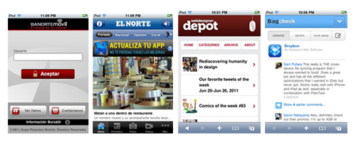
Mobile Internet usage is on the rise, and the world of Web design continues to evolve—so designers must learn to accomodate mobile devices. Thinking “Oh, my users won’t visit my website on a mobile device” is the worst mistake of all.
No one can stop mobile usage from increasing, and the odds are that every website will receive visitors on mobile devices. So, the best strategy is to be as prepared as possible.
Just thinking about mobile users isn’t enough to address the situation. Many mistakes are still committed during the process, and knowing what they are is the first step in effectively avoiding them in future projects.
The following are the most common mistakes on mobile websites.
Not accounting for device width
Không chiếm chiều rộng thiết bị
Điều này có vẻ hiển nhiên, nhưng một awful nhiều trang web như thế này trên một thiết bị di động (trong trường hợp này, iPhone):
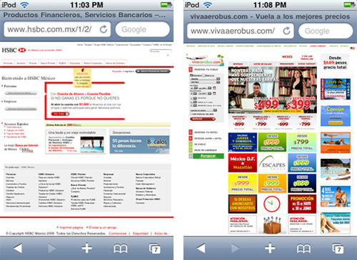
You should understand the maximum width that elements on a page ought to have, as well as be able to format an entire HTML document to account for various screen sizes.
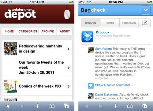
In the screenshot above on the left, the website is formatted for variable device widths, but its elements are not. The website on the right is not formatted for variable device widths, so its elements appear far too small. Even if the body element was set to a narrower width (320 pixels, for example), it would just get pushed to the far left of the screen and still be small and unreadable.
This can be fixed with a simple HTML line in the <head> of each document:
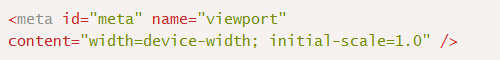
This small detail, along with formatted elements, will make for a good mobile experience.
Making users fill out long forms
Filling out forms is annoying even on desktop computers, and it’s even more tedious on a mobile screen. Designing a web form for mobile devices is a complex task; focus on building simple forms that don’t ask much from users.
Set the type of input being requested from the user, so that the keyboard has the elements that the user needs when they focus on the field. For example, setting a field’s input type as number will set the keyboard to display numbers by default, instead of letters.
Not reconsidering content
Transferring content from big-screen web environments has come to involve its own strategy, like when content had to be transferred from print to web. Space and focus constraints on mobile devices are far more significant than those on computers.
Luke Wroblewski’s “design for mobile first” methodology defines a strong approach we can take. It discourages us from generating one set of content for the desktop web and another set for the mobile web. A mobile design team should consider whether content that will not appear in the mobile version is even necessary? Perhaps it doesn’t even need to appear in the desktop version.
Using content for decorative purposes or just to fill space almost guarantees that it will be removed later, so why not consider just essential content from the beginning?
Going through this process can uncover other common mistakes and problems.
continue....


September 22, 2012 8:45 am / Reply
Nulla lobortis facilisis eros vitae mollis. Morbi consectetur, tortor ut feugiat rhoncus, nunc augue placerat massa, sit amet laoreet est libero quis nisl. Integer cursus sodales sem eu dapibus. Morbi lobortis eleifend lectus sit amet porttitor. Nam tincidunt congue laoreet.