Sep
25
2012
Mobile Web Design: 10 Tips To Better Usability
 admin
admin blog,event
 10 Comments
Mobile web browsing is expected to turn into the next major Internet platform. It is now easy to browse the net from nearly anywhere utilizing mobile devices that fit in a hand because of technology. Being short in good usability implementation in mobile web design makes it difficult browsing your way around various popular mobile websites. Designing for mobile devices needs to be simpler than its standard website and more task-based to get the job done because users look for something specific and urgent.
You should take into account on how to use the barest minimum of the available space for your major contents and remain interesting for mobile users. Avoid large images and flash animation as it will slow down your site. Remember that functionality is more important than style for mobile websites. If your website is not coded and design properly, it could look better on one phone, worst on another or worse, not displaying at all. Test, validate, and check if it’s compatible with all mobile devices.
To aid you in creating website that is accessible not just on desktop or laptop computers but also mobile devices, here are some of the things to consider on mobile web design with sample images together with the mobile website version’s direct link.
1. Decide on the screen resolution
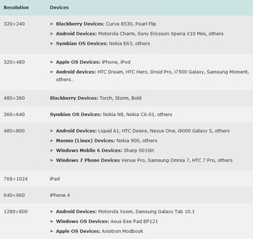
The mobile world contains a rich variation of design considerations from different screen sizes and resolution to a variety of shapes. Aim to strike a balance between sufficient screen width and audience size. Find out the specs of current mobile devices and use your best judgement. What’s challenging for mobile developers is the way to get one to display appropriately across a range of screen sizes without having to recreate pages for different platforms.
Here is a list of web resolutions popular on mobile devices as of February 2011 presented by Uxbooth.com with their published article, Considerations for Mobile Web Design (Part 2): Dimensions, by David Leggett. The author explains a few points about display dimensions and solutions for layout design.
2. Break up web pages into small portions
Lengthy sections of text can be hard to read so placing them on several pages limits the scrolling to one direction. Get rid of low priority content. Stick to a single column of text that wraps so there’s no horizontal scrolling.
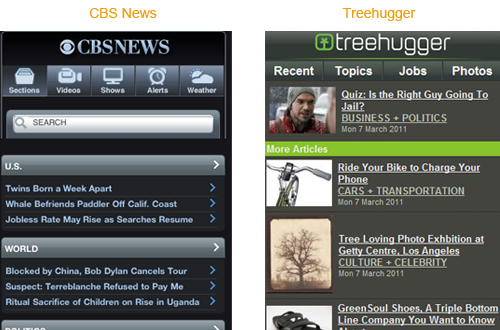
For the example below, CBS News mobile website version shows only the major news section and breaks the news articles into small portions. While Treehugger presents itself with their recent articles and latest tweets with some of the features of the full website. Both sites have the user click a text link to view the rest of the article.
3. Simplify the design
Simplicity equates to usability. Let them move around the site with no difficulty. Avoid the inclusion of tables, frames and other formatting. If you use padding, remember to keep it to an absolute minimum far less than you’d use for a normal web page. Compared to desktop computers, the more you click the links on mobile websites, the more you wait because of loading time. With that, you need to strip down and simplify your website with balance between content and navigation.
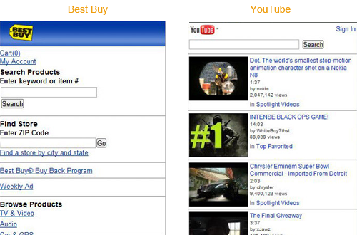
For our example, the mobile version website of Best Buy list only the most essential product categories trimming down the level of hierarchy for content. While YouTube mobile home page shows only the four latest spotlight videos.
continue....


September 22, 2012 8:45 am / Reply
Nulla lobortis facilisis eros vitae mollis. Morbi consectetur, tortor ut feugiat rhoncus, nunc augue placerat massa, sit amet laoreet est libero quis nisl. Integer cursus sodales sem eu dapibus. Morbi lobortis eleifend lectus sit amet porttitor. Nam tincidunt congue laoreet.